Small changes can cause big improvements. Todays topic is about small css improvements, resulting in visual feedback for your visitors and improvements to your blogs user interface. Most of the CSS below only works in the newest browsers, but it shouldn’t prevent you from using it.
Don’t just change the color of the link, provide feedback
Instead of just changing the color of your links, provide your websites’ visitors with visual feedback for their interaction.
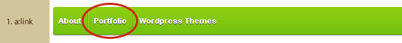
1. Improve the contrast between background and foreground
If you have a low contrast between the link-color and the background-color (white on light-green, like in the image shown above), apply a light text-shadow to your navigation links.
The text-shadow property adds a grey drop-shadow with one pixel to the bottom relative to the text (0px on the x-axis, 1px on the y-axis, 0px blur radius and the color #555)
a:link { text-shadow: 0px 1px 0px #555; }
Note: This effect is only visible in Firefox 3.5+, Safari 3+, Opera 9+ and Chrome.
2. Highlight the state of the link
Change the color for an :hover effect, or like I did in the navigation, apply a darker and slightly bigger text-shadow to the link.
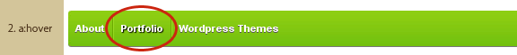
With the following CSS applied, the link has a light 3D effect, like hovering over the navigation.
a:hover { text-shadow: 1px 1px 1px #000; }
Note: this works only in Firefox 3.5+, Safari 3+ and Chrome, but neither in Internet Explorer nor Opera 9+
3. Show me the click
If it’s a link, let the link show some reaction.

Use a:active to apply a small button-style effekt to your links. As a result to the code shown below, your link will “jump” 1px below its current position.
a:active { position: relative; top: 1px; }
4. Seamless transition for links & visible states
If image 4 + 5 looks the same to you — well, that’s by intention.
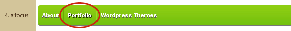
The 1st page, right after you clicked the link, but before the 2nd page loads.
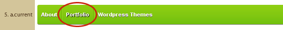
The 2nd page after the click.
I use the same color for a:focus and a.current (whereas .current is the class applied to the current page link on the 2nd page.
a:focus, a.current { color: #111; }
I also used it to create a seamless transition between the 1st and the 2nd page. Note, it’s only useful if you know, that the now current link on the 2nd page is at the same position like the a:focus on the 1st page, e.g. the navigation above. Also note, if it’s not obvious that the new page loaded, because of a very big header using the browsers complete viewport, this effect can be confusing. It can also be confusing if your page loads very fast or very slow.
5. The complete transition effect

If you haven’t seen a lot of changes in the images above, open my website with either Firefox 3.5, Safari 4, Chrome 2 or Opera 9+ and check the top navigation above.
Comments
14 responses to “Provide visual feedback using CSS #1”
Thanks
I love this theme
its very nice
Backup your customized version of the cordobo green park 2 theme and upload the unchanged files of the original theme to your server and activate this theme.
If this works and the search field will be shwon, you should check your customized theme.
HTH
Hi
where do I have to do this editing?
Nowhere ;) It’s implemented in my theme Green Park 2.